MCATA
Logo Design
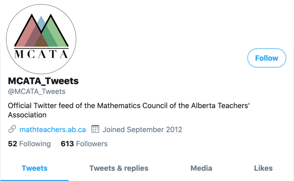
This logo was designed for a competition held by the Alberta Teachers’ Associations Mathematics Council (MCATA). MCATA needed an updated logo that represented the intersection between teachers, students and the mathematics curriculum.

The three triangles that intersect in color represent the students, teachers and the mathematics curriculum. Triangles were chosen for math, as they represent change in formulas. As the triangles interact and overlap, the colors get more complex and combine into their own shade representing how each triangle affects the other. I worked closely with an Alberta math teacher to create this logo. We believed that representing and highlighting the interactions between the three groups creates a powerful, unified message.
Process:
This process began with thumbnails by drawing and intersecting, building on the original MCATA Venn Diagram motif. I decided to go with triangles as it gives the intersection MCATA wants with a fresh and modern look. I kept the serif style font used in their branding to marry my design with their existing design brand.


